Change the Theme
Choose the colours, fonts and button corners used by your site.
Steps
If the menu is hidden, click Open menu first.
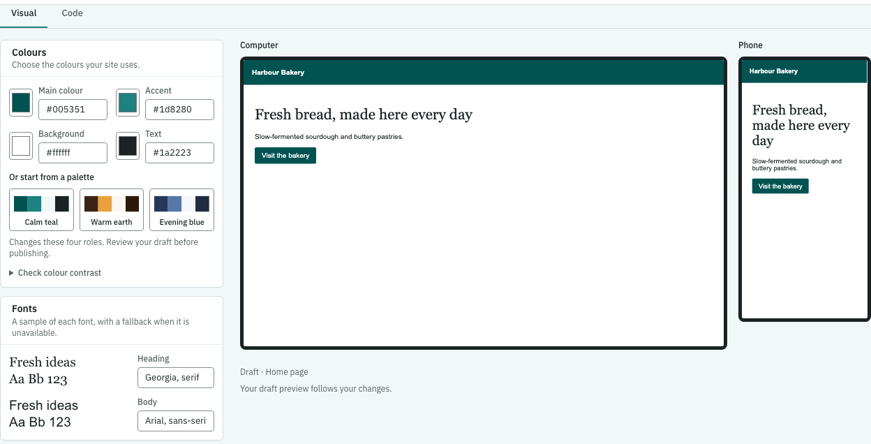
- As a site administrator, open Theme and choose Visual. You’ll see the design values and computer and phone pictures of a page.
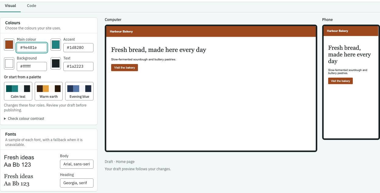
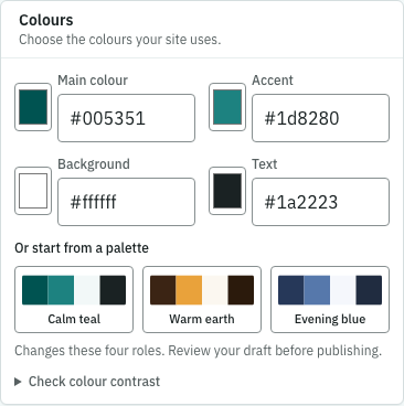
- Change Main colour, Accent, Background or Text. Open More colours for other colours. Watch both pictures update as you work.
- Under Fonts, change a font value. Under Sizes and button corners, choose the corners you want. The available controls depend on the values in your site’s design.
- Pause until Saved as a draft. appears. To publish this Theme, click Publish theme, read the confirmation “Publish the theme?” and click Publish theme.
Look of forms, buttons and images
A theme can keep Keel’s look for parts or leave the look to the theme. In Theme, Look of forms, buttons and images offers Keel’s look (recommended) and My theme’s look only. Keel adds just what parts need to work. The second choice keeps the layout a part needs (sliders, columns, embeds, and a form’s hidden and required behaviour) and leaves colours, spacing and control sizes to the theme. A theme that has never chosen still uses Keel’s look.
For an AI helper, the theme’s partStyles is keel or structural, for example:
{ "css": "body{margin:0}", "tokens": {}, "partStyles": "structural" }If something goes wrong
If a colour or value is refused, fix the named field. If the preview cannot update, check your connection and wait for it to recover. A missing value needs your designer or helper to add it. A draft stays private until you publish it.